Aura Component Development Quickstart Guide

Writing Aura Components For Salesforce
This tutorial is a quickstart guide and overview for writing Aura (aka “Lightning”) components that run within a Salesforce instance.
Why Aura?
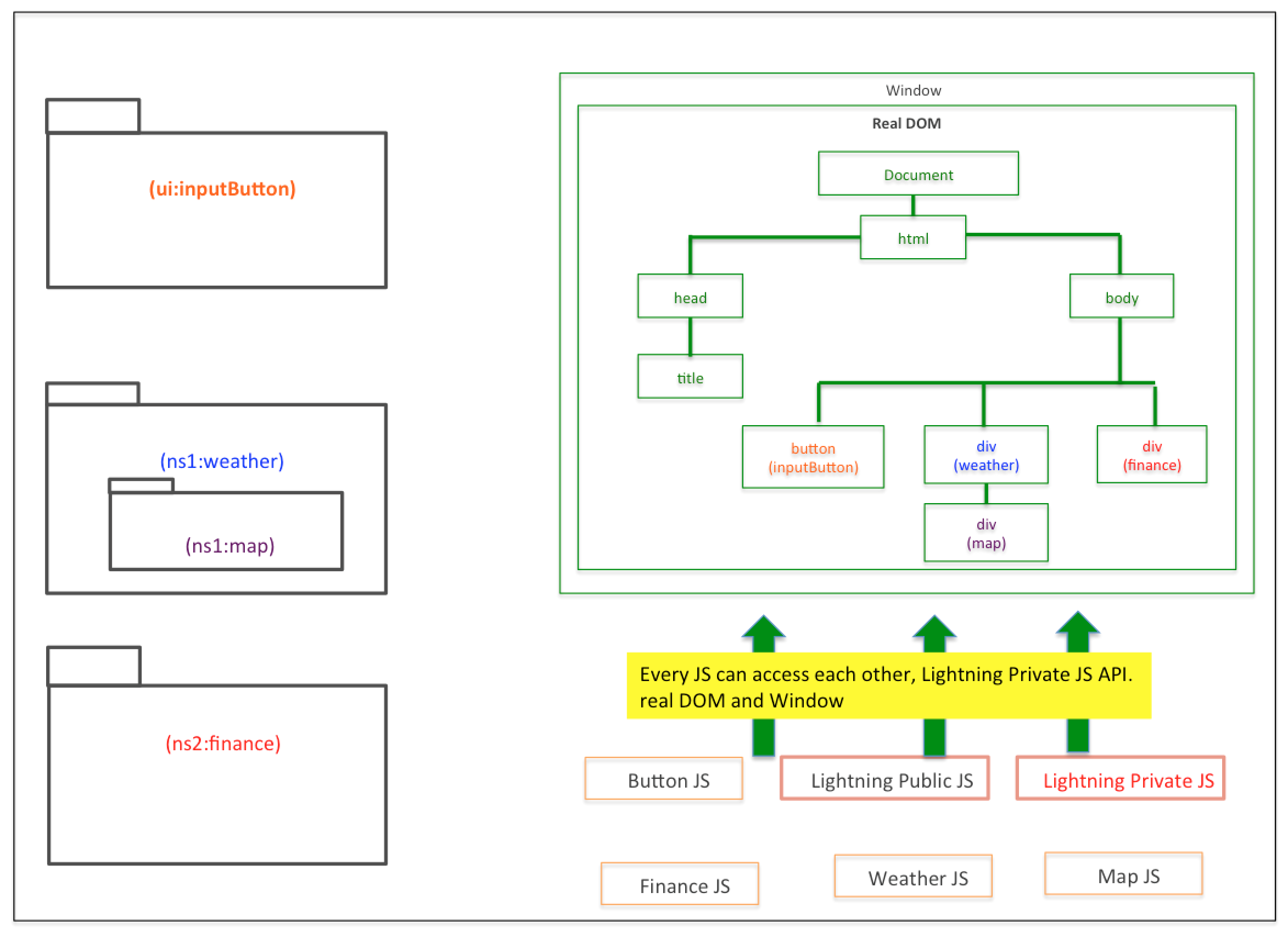
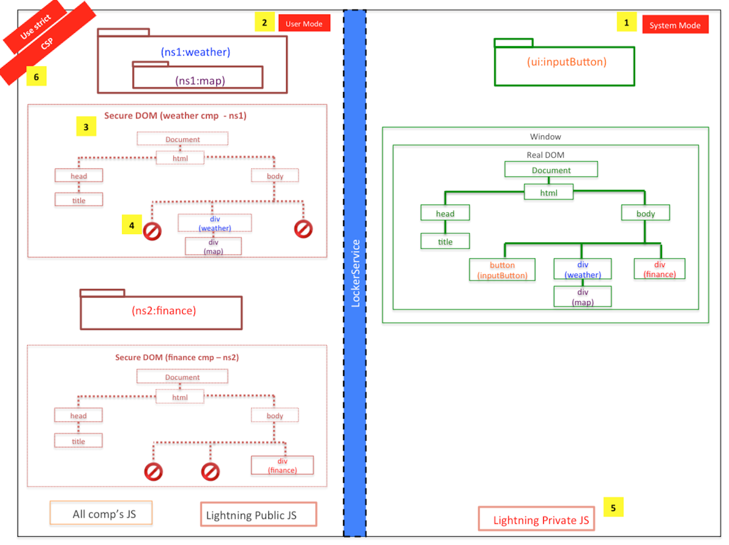
The Salesforce ecosystem allows developers to extend the platform and build their own “apps” using Salesforce data and pre-existing API functionality. This means, your sales team can use a visual GUI to build up data sets of customers - and with Aura you can build front-end components that easily tap into this data and manipulate it for display purposes. It is also possible to tap into Salesforce data using other front-end libraries, such as React or AngularJS. However, Salesforce would prefer you use their own front-end framework so that you can get the full benefits of “Lightning Locker Service” - a security service which prevents front-end Aura components from being able to traverse the DOM into another front-end Aura component. This is a bit tricky to understand the importance of at first, so lets start with a diagram:

This is your Salesforce instance without the use of custom Aura front-end components and locker service. You can create, update, and delete records and you can also view them via the standard views generated by Salesforce. You can integrate your own SPA framework if you would like, and hook into standard API’s or SDKs provided by Salesforce to access Salesforce data. However, your front-end components will have some level of risk associated with them, as the nature of the DOM allows for components to traverse out of their own markup and access the markup of other components on the same page.

This is where Aura comes in, although we could build our components up using AngularJS or another front-end component framework - the data would be exposed to anything traversing the DOM. If your front-end component displays sensitive sales information, and you put it right by a third party component from another developer - that third party component could traverse the DOM up to your data and send that sensitive information back to it’s own servers. This is of course a security risk, and is the reason why Aura is preferred by Salesforce for building out new Salesforce UI components.
Getting Started With Aura Development
Unfortunately, the developers tools for building Aura components are very naive right now and at times difficult to work with. Most front-end frameworks are written in a pseudo-Javascript, and than compiled down to Javascript. As a result of being originally designed by a team of Java developers, Aura has some quirks in this regard. In particular, the pipeline for rendering an aura component is pseudo-Javascript -> HTTP -> compiled in server-side Java -> HTTP -> rendered Javascript. This design choice also proves a huge performance bottleneck, and so for applications that require many re-renders Aura might not be the best choice even though it provides additional security.
This means, that in order to develop Aura components right now (prior to SalesforceDX) - you will most likely have to use the integrated web-based developer tooling. Cloud9 also has a Salesforce offering, but I have not yet used it and cant vouch for it as a result (this could be a better option though).
To get started with Aura development in it’s current stage you will have to open up your Salesforce instance my-instance.salesforce.com and navigate to the top right menu bar. From here you can open the “developer console”.
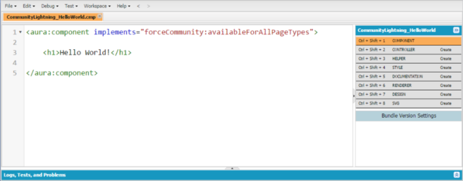
From the developer console you are going to want to select “file” on your menu bar and than click new -> lightning component. This will generate a lightning component bundle which starts out with just a .cmp file (similar to HTML), but can be extended to include other pieces such as controllers, helpers, and renderers. Click these pieces on the right of the developer console to generate scaffolds and add them to your lightning component bundle.

Lightning Component Bundles
Now I will explain each piece of a lightning component bundle, and their roles in building front-end components.
Component
Clicking “component” on the right side of the developer console will generate a file called my-component-name.cmp. These files take standard HTML, in addition to templating logic contained within { and } such as {! v.myData }.
These files are your views, and act very similarly to other templating files such as handlebars or spacebars. However, there are a few quirks:
- Once the lightning component goes to the server to be compiled, the HTML is validated. This means that if you have improperly formatted HTML or are missing opening/closing tags the server will reject your markup. Usually, this is good - but there are edge cases where valid HTML will be rejected by the server.
- Unlike many modern templating engines, Aura’s templating engine not only supports in-markup logic but actually promotes it. This is design decision that may not be correct, but is something you will have to learn to work with. Occasionally, you may be forced to put large blocks of logic inside of the view.
- Finally, the logic you place inside of the view looks like Javascript, but it is not Javascript. It is another proprietary Salesforce language which is not very well documented. You will have to experiment around a bit, but you will find some quirks (e.g. string interpolation does not work even on ES6 compatible browsers, but join() does). The Salesforce Stack Exchange is an excellent resource for working through these problems.
Now, in order to define data inside of a Aura component we can’t actually define the data inside of a controller or helper. This can be confusing at first if you are used to frameworks that promote separation of concerns by keeping logic and views removed from each other. In lightning, your data and views are intermingled by design. So in order to store data, we need to define data inside of the markup and act on data inside of the helper, which is called through the controller.
Let that sink in for a moment.
Lets take a step back and look at an example Aura component:
<aura:component implements="force:lightningQuickAction" access="global" >

  <!-- Begin Public Attributes -->
  <aura:attribute name="message" type="String" default="Hello, World!"/>

  <!-- Begin Markup -->
  <div class="my-component">
	  {!v.message}
  </div>

</aura:component>
In this component, we start out with a
<aura:component ...>
tag which tells us this is an Aura component. Next we have an attribute called implements which defined where this component can be used inside of Salesforce. In our case,
implements="force:lightningQuickAction"
defines our component as a pop-up modal which can be called from within other Aura components.
Next we define an attribute which is the equivalent of a variable scoped to your entire lightning component bundle:
<aura:attribute name="message" type="String" default="Hello, World!"/>
This attribute has an attribute (yes, our attribute has attributes) name which acts as a unique identifier, a type which in this case is a String and a default which is entirely optional but sets the value of the data to Hello, World! when the component is initialized.
All Aura attributes can be referenced under the namespace v.myAttributeName:
{! v.message }
Style
By clicking “style” in the right hand side of the developer console, you can generate a .CSS file for your Aura component. This CSS file works just like standard CSS, but is preprocessed before being dropped into the browser. The main thing to look out for is namespacing.
In order to namespace CSS to the component, each CSS declaration must be prefixed with .THIS. The .THIS is a marker that will be replaced with a unique identifier once it comes time to render your component in the browser.
.THIS .myComponent {
    background-color: #fff;
    margin: 0;
    border: 1px solid #333;
}
Use the generated CSS file to style your components, but also remember that all Aura components have access by default to a subset of SLDS - the Salesforce lightning design system CSS framework.
Controller
Generating a controller will provide you with a myComponentController.js file. Unlike other MVC frameworks where the controller is responsible for handling the bulk of view logic, and one-off ad-hoc functionality is delegated to helpers - in Aura the controller has extremely limited functionality and is only used for making calls to the helper.
It’s easy to try to put your logic in the controller when you begin writing Aura components, but you will soon find out the limitations of this. For example, controller methods cannot call other controller methods (except via some DOM hackery) so you end up with very bulky multi-purpose methods (a bad practice from a architecture perspective).
Instead, we will use our controller methods as an intermediary between the .cmp markup and the helper file:
({
  helloWorldButtonClicked: function(component, event, helper) {
    helper.printHelloWorld(component);
  }
})
As the intermediary, the controller is responsible for passing through the required data to the helper which it gathers from the markup. It has access to the component param as well, which is a JS object containing a representation of the entire component including the attributes in the .cmp.
You can call controller methods quite easily in the markup by using pre-registered actions as such:
<button onclick="{!c.helloWorldButtonClicked}"></button>
However, please be careful when referencing a controller action using the c.actionName namespace. If your component is registered to an Apex controller in addition to it’s Javascript controller they will both be merged into the same namespace. In otherwords:
public ArrayList<Integer> getValues() {
    return new ArrayList<Integer>();
}
and
getValues: function(component, event, helper) {
   values = // some API call to serverside getValues();
   return values;
}
will both get registered as c.getValues:
{!c.getValues} <!-- will throw error -->
Helper
The helper is where the magic happens in Aura. This is where almost all of your logic should go, and anytime you are making third party API calls or calls directly to the Salesforce SOAP API’s they should be inside of here.
The helper looks identical to the controller, but has a different default scope. In order to gain access to the markup we need to pass the helper a component object provided by the controller:
({
   printHelloWorld: function(component) {
    let message = component.get('message');
    console.log(message);
  }
})
Since helpers can also call other helpers easily, it makes it possible to break down your code into more modular bits for the sake of organization:
({
  printHelloWorld: function(component) {
    let message = component.get('message');
    this.printToConsole(message);
  },

  printToConsole: function(text) {
    console.log(message);
  }
})
Renderer
The renderer is going to used much less often, but can be very important. The render has default functionality (rendering and re-rendering the component mostly), but all of these steps have hooks that you can add additional functionality to.
For example, if you are writing a component that displays a form field and between loads the data is persisting in the form field (a common problem caused by the garbage collector not being entirely efficient in single page applications, and leaving variables in ephemeral memory) - you can use one of the lifecycle hooks to manually wipe form state whenever the component is re-rendered. Be cautious however, as other parts of your component (e.g. validations) might trigger early re-renders. Doing your research into the lifecycle of an Aura component is essential for these lower level problems.
({
  rerender: function(component, helper) {
    helper.clearApplicationState();
  }
})
Documentation, Design and SVG
Each Aura component bundle also comes with documentation, design and SVG files.
The SVG dictates an icon which will be visible to admins within Salesforce UI looking to implement your UI component.
The documentation is simply a XML style documentation block which will also be present for admins when scrolling through a list of lightning components they wish to use (for example in lightning communities - a visual page builder).
The design file allows you to specify what attributes in your lightning component can be set by an admin. For example, if you have a cost component you can let an admin of a lightning community decide if they wish to display the cost in USD or another currency by defining a dropdown menu of choices within the .design file.
Use Cases for Aura Components
Depending on how you swing your usage of the implements tag, you can integrate Aura components inside of lightning tabs in Salesforce, or inside of the upcoming lightning communities which you can deploy from your Salesforce instance to build custom web applications on top of Salesforce data and functionality.
I’ve found that lightning tabs are the easiest way to debug your Aura components, but sometimes the CSS and JS caches are out of sync. The way CSS and JS are cached is not public information but in my experience it can take up to 5 minutes in a tab for full synchronization after modifying a component and reloading the tab for testing.
Lightning communities do not seem to have this problem. However, they do have some quirks regarding their versioning of SLDS CSS (it is not always the same as on the rest of the platform) and URL hyperlinks. When I test components in lightning communities I opt to open up the page in the builder and than preview -> open in new tab. The new tab is reloadable so you don’t have to navigate through the builder every time you push new code.
Conclusion
Aura acts similarly to other frameworks, albeit with a bit less polish and a few more quirks. It offers you a lot of power on top of Salesforce, but is still new technology and is frequently improving. If you begin building Aura components right now, I would consider you an early adopter. I think the technology has a lot of potential for powerful and rapid development, and I am excited to see where it is in a few years.